Investor-Ready Website Checklist: What VCs Actually Look for in 50 Milliseconds
For a startup seeking funding, your website is the first thing an investor sees. If it looks amateurish, the credibility gap is immediate.
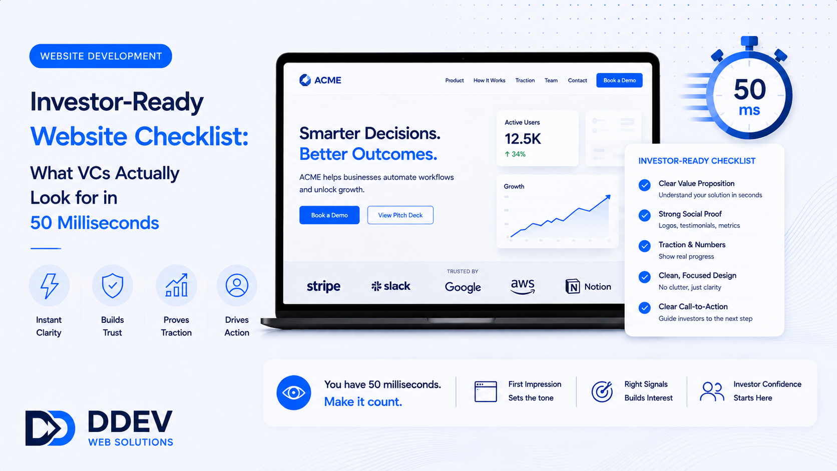
Research by Lindgaard et al. found that people form visual opinions about a website's credibility in as little as 50 milliseconds — before they read a single word.
For a startup seeking funding, your website is the first thing an investor sees after your cold email, your pitch deck, or a warm introduction. If it looks amateurish, cluttered, or broken, the credibility gap is immediate — and it colors everything that follows.
VCs see thousands of startups. The ones that look like they have their act together get more meeting time, more favorable first impressions, and more benefit of the doubt.
Your website is not your product. But it is the packaging for everything you are asking an investor to believe.
What VCs Actually Check on Your Website
After talking to founders and studying investor behavior, here is the pattern:
1. Clarity of Value Proposition (5 seconds)
What does this company do? If an investor cannot answer this question after 5 seconds on your homepage, you have a messaging problem.
The hero section should state: what you do, for whom, and why it matters. One sentence. No jargon. No "leveraging AI-powered synergies."
Good: "Automated compliance monitoring for Indian fintech companies."
Bad: "Next-generation solutions for the future of finance."
2. Team Page (30 seconds)
Investors invest in teams, not just products. Your team page should show founders' names, titles, and photos, brief backgrounds covering previous companies and relevant experience, LinkedIn profile links, and advisory board members if notable.
A startup with no team page — or a team page with only first names and no backgrounds — signals a red flag.
3. Traction Indicators
What evidence suggests this startup is real and growing? Display customer count or user numbers, revenue milestones ("₹2 Cr ARR" or "500+ paying customers"), notable client logos (with permission), press coverage or awards, and product screenshots or demo links where applicable.
You do not need all of these. But you need at least one credible traction signal.
4. Product Clarity
Can the investor understand what the product does by looking at the website? Screenshots, a product demo video (under 90 seconds), or an interactive demo link answer this.
A startup with no product visuals on its website looks like a PowerPoint company.
5. Professional Design Quality
This is where the 50ms judgment happens. A visually polished, modern, fast-loading website says: "We care about details. We build quality products."
A cluttered, slow, template-looking site says the opposite — even if the product behind it is exceptional.
The Investor-Ready Website Checklist
- Hero section: One-line value proposition + supporting sentence + CTA ("Request Demo" or "Learn More")
- Product section: Screenshots, product video, or interactive demo
- Traction section: Numbers, logos, or milestones
- Team page: Founders with backgrounds, photos, and LinkedIn links
- Press/blog section: Media mentions, published articles, or company blog
- Clear CTA: "Schedule a Demo," "Talk to Sales," or "Contact Us" — visible and prominent
- Fast and responsive: Under 3 seconds on mobile, clean on every device
- Professional design: Consistent typography, intentional color palette, quality imagery
- Working links: Broken links, 404 pages, and placeholder content are instant credibility killers
- SSL certificate: HTTPS is non-negotiable in 2026
What Not to Do
Do not over-engineer. Your website is not your product. A clean, fast, well-designed single-page site is infinitely better than a bloated multi-page site with half the sections incomplete.
Do not use jargon. "AI-powered, blockchain-enabled, cloud-native solution" tells an investor nothing. Describe your product in language a smart person outside your industry would understand.
Do not hide the team. An anonymous startup is a suspicious startup. Show who is building this.
Do not use placeholder content. "Lorem ipsum" on a startup website is a red flag that suggests the company is still in "pretend" mode.
Do not neglect mobile. Investors check websites on phones — between meetings, in transit, after receiving a pitch email. A mobile-broken site loses credibility before the pitch.
Frequently Asked Questions
How much does an investor-ready startup website cost?
A well-designed startup website with a clean homepage, product section, team page, and CTA costs ₹50,000-₹1,50,000. Monthly hosting and maintenance run ₹2,000-5,000.
Should I build a website before I have a product?
Yes — but set expectations correctly. A pre-product website shows your vision, team, and problem statement. Add a waitlist signup or "Request Early Access" form to capture interest.
Is a landing page enough, or do I need a full website?
For very early-stage startups (pre-seed), a strong single-page site is perfectly fine. Once you have a product, traction, and are actively fundraising, expand to a multi-page site.
Can my website help with fundraising beyond credibility?
Yes. A blog with thought leadership content positions founders as domain experts. Product demo pages reduce the number of introductory calls. Press/media sections build social proof that strengthens your pitch narrative.
Look Like a Startup Worth Betting On
DDev builds startup websites that pass the 50-millisecond credibility test — clean design, clear messaging, team profiles, product showcases, and traction signals that make investors want to learn more.
Talk to DDev About Your Startup Website.